BrandingMagma (Turkey) · 2020
Magma
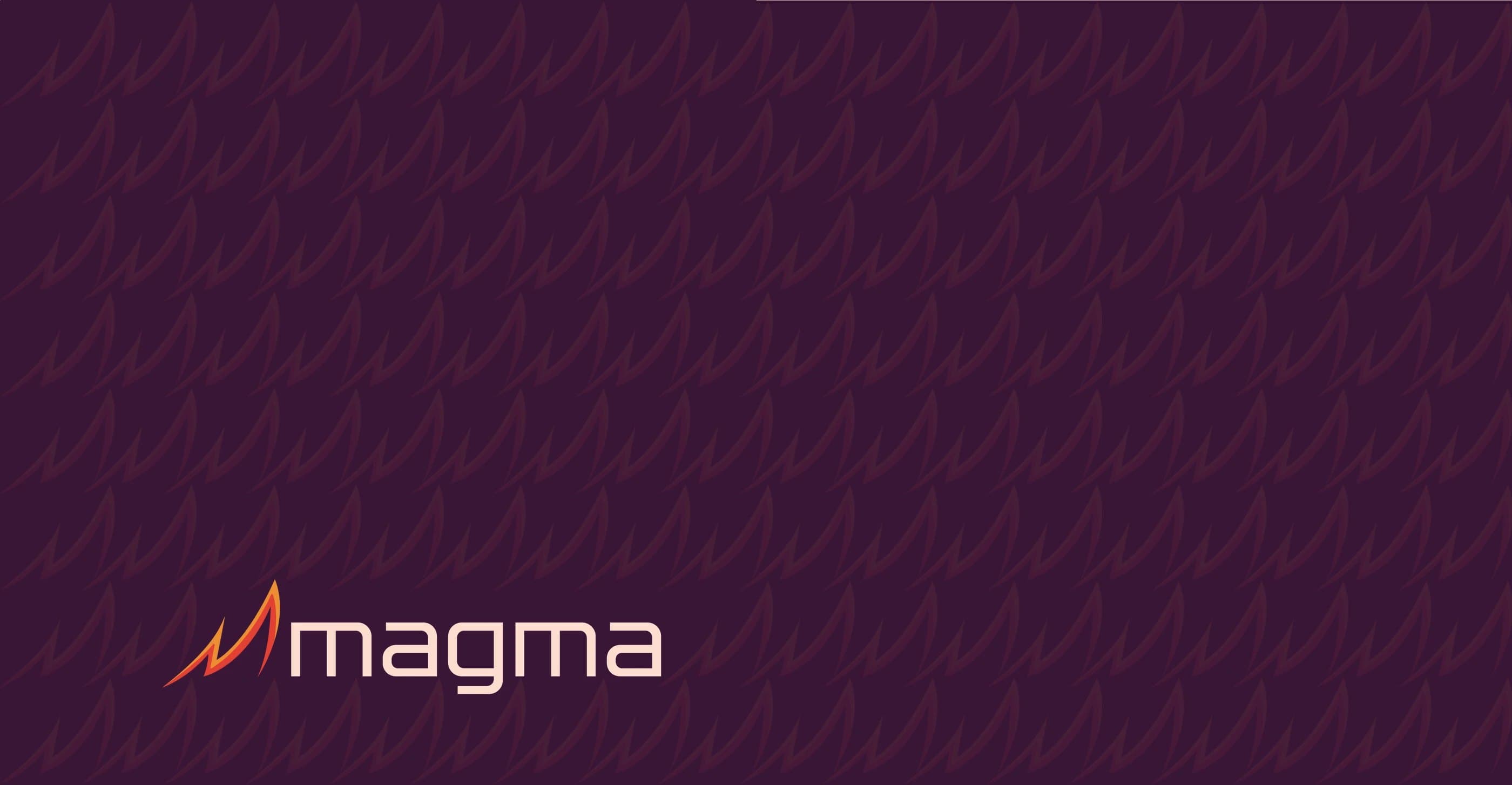
One mark, three meanings, the name, the source, and the growth.
Scroll
- Client
- Magma (Turkey)
- Year
- 2020
- Role
- Brand Designer
- Timeline
- 3 weeks
Overview
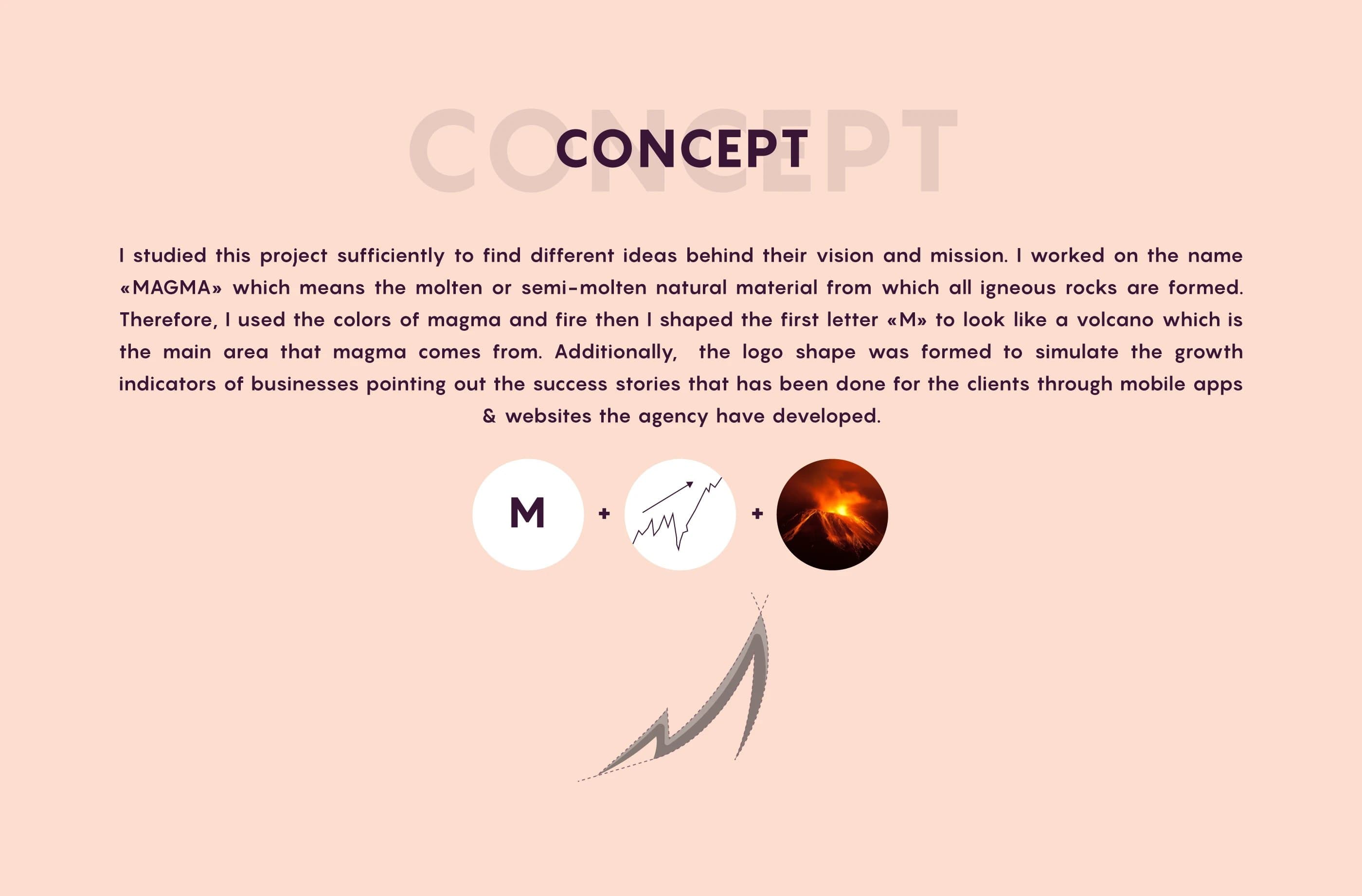
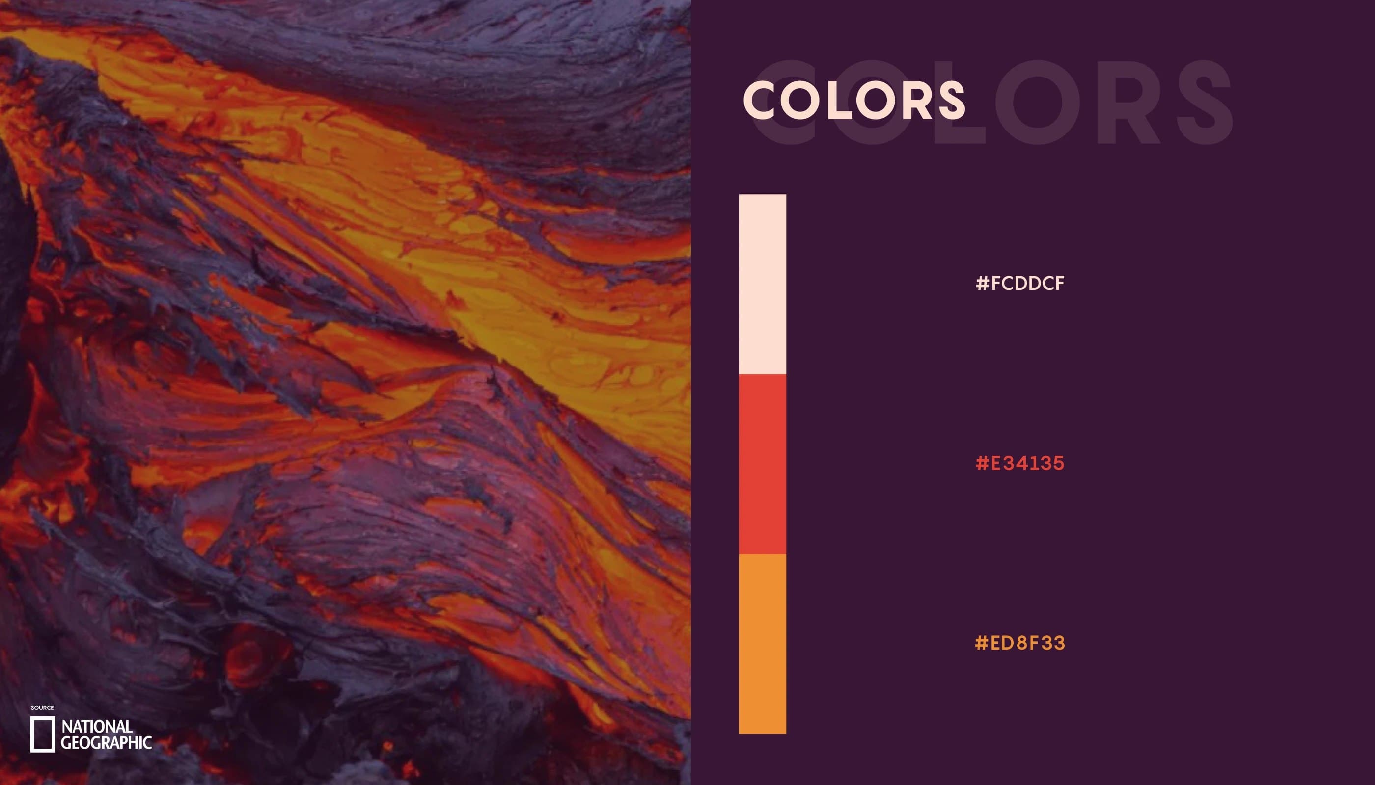
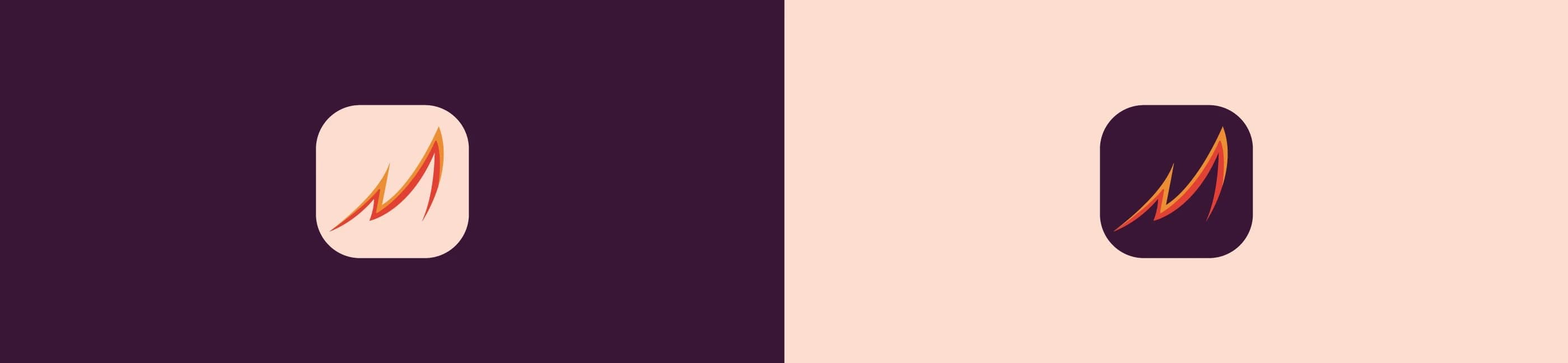
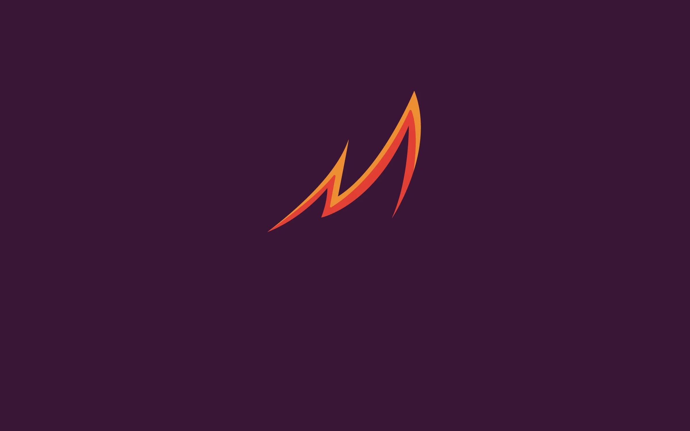
I built the mark on the name itself. Magma is the molten material all igneous rock forms from, so I used the colours of magma and fire, and shaped the first letter "M" into a volcano, the place magma rises from. The same form doubles as a business growth curve climbing upward, a nod to the success Magma creates for clients through the apps and sites it builds. One mark, three meanings stacked: the name, the source, and the growth.
- Brand Identity
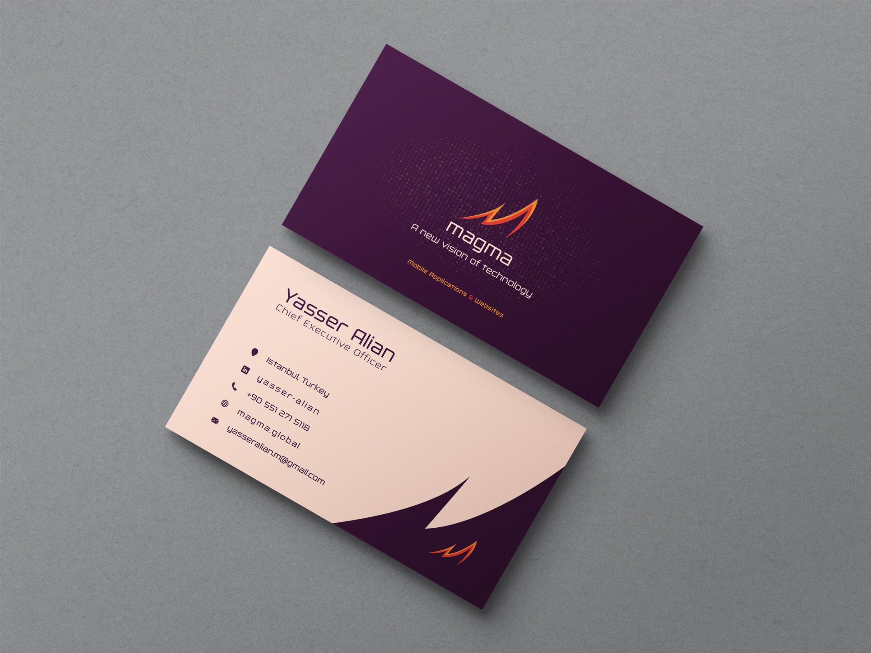
- Business Card
Gallery
The work.